D’Addario
The challenge from D’Addario was to combine six sites from all of the brands they have acquired over the years into one experience under the D’Addario name. Products needed to be categorized and recognized as being under one umbrella visually while at the same time, the individual brands which have devout followers must stand out and be recognized for the quality which has made each beloved. In order to accomplish this I designed a system that used universal graphic elements for product details, charts and sound information. These exist on the same pages along with brand story components that were flexible enough to tell the story of both an Evans drumhead or a D’Addario NYXL electric guitar string set. Visit D’Addario

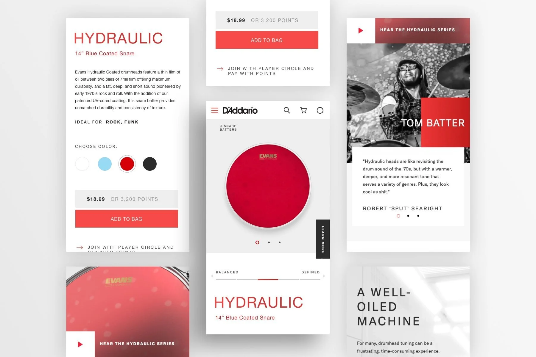
Drumhead PDP
Above- The product detail page was designed with the following crucial updates in mind. Making the image much larger to show detail and clearly showing color, material, range options was all vitally important. A color bar at the top right was designed to be flexible and able to accommodate products like a drumhead with a “tone” from “bright to dark” through to a completely different product of a guitar string with a gauge difference creating “bright to mellow”
Below- In addition, lots of story telling elements were conceived and added like artists who use this very product, detailed cg renderings of the product, and of course suggested cross-selling components.
Tech Specs

Tech Specs
Above- The technical specifications of each product can be pulled up via a full-screen overlay.
Below- I drew inspiration for the design of the technical specification system from the drumhead packaging and worked with the D’Addario Product Design team on the iconography to represent each variant.

Drumhead PDP Mobile
Above and below- you can see the mobile design for the product detail page. The emphasis on large clean product imagery alongside flexible brand story telling elements continues through all mobile design.


Before and After:
Above are the before and after shots of the Product Detail Page for drumheads. Information like the bright to mellow scale used to live on the product landing page level on the old D’Addario site (left). After much research and consideration, we decided it would be best to move that information to the top of each product detail page in the new design and still have updated filters on the PLP level to guide the user there as well.
Below are the before and after shots of the Product Detail Page for strings.


Pressure Testing
Many, many products were tested with the new design to ensure every kind of product each with very different needs was accounted for. Lots of type styling, button styling, and interface in general was proposed to the client to see every option.

Featured Artist Content
A mosaic grid component was designed that allowed for video, gif, or photography for the story telling aspect of every product on the PDP level.

Zoom
Many possibilities for the zoom function were tried. Above is a full screen zoom of the product, and below is a window zoom.

Mega Menu
Two options were created by my UX partner. Below I outline the options and then show the final visual design for Option 2- the preferred design.


Option 1
An exposed mega menu showing the structure all in one view on desktop:
Aligns to taxonomy
Different design & UX for mobile
Mav cause choice paralysis on desktop
May not fit properly on some screens
Requires scrolling to see all options
Shows up to 4 levels in one view
Option 2
A faceted navigation showing only focused options for each step:
Aligns to taxonomy
Mobile-first
Adapts to an screen size
Focused options
Similar design & UX for any device or browser size
Prevents choice paralysis
Acts as a 'pre-filter"
Shows up to 4 levels in one view
Mega Menu Final Designs

Above Desktop- In order to fit such a vast listing of product categories in to the mega menu, we chose to go with focused top categories and have the user drill deeper with this pre-filter.
Below Mobile- In the mobile menu you can see three levels here from tapping Percussion from the main menu in to Drumheads and from that level, it will next be a product landing page such as Marching. As in desktop, there is one featured product for each category at the bottom.

Search & Search Results
For the search I chose a very simple interface to start the search. It make for a surprising transition when search is initiated, and the user is presented with so much content including closely matching recommended popular products, filter and sort by including a dynamic product grid of results.

Below- Search Results Mobile

D’Addario Working Process
A video created by the agency Valtech showing the working process with the D’Addario team and a bit about the advantages os Episerver (now Sanity), the CMS we chose to go with.